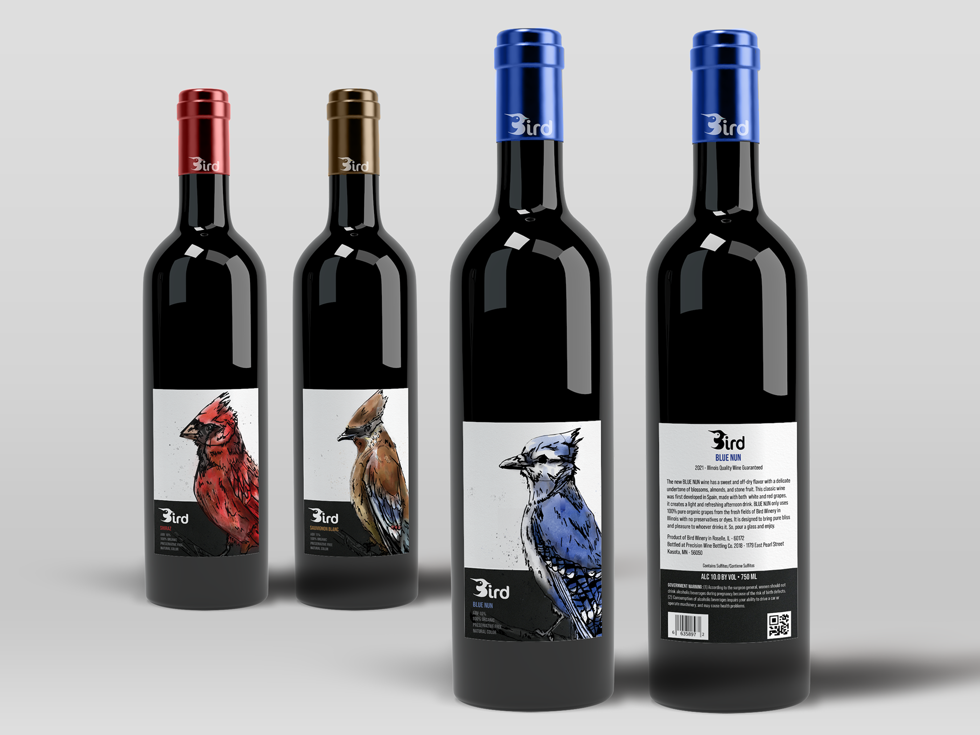
Challenge:
Create three cohesive labels for three different wines from a Midwestern winery that appeals to young, artsy wine drinkers (audience age range of 21 to 32 year-olds).
Solution:
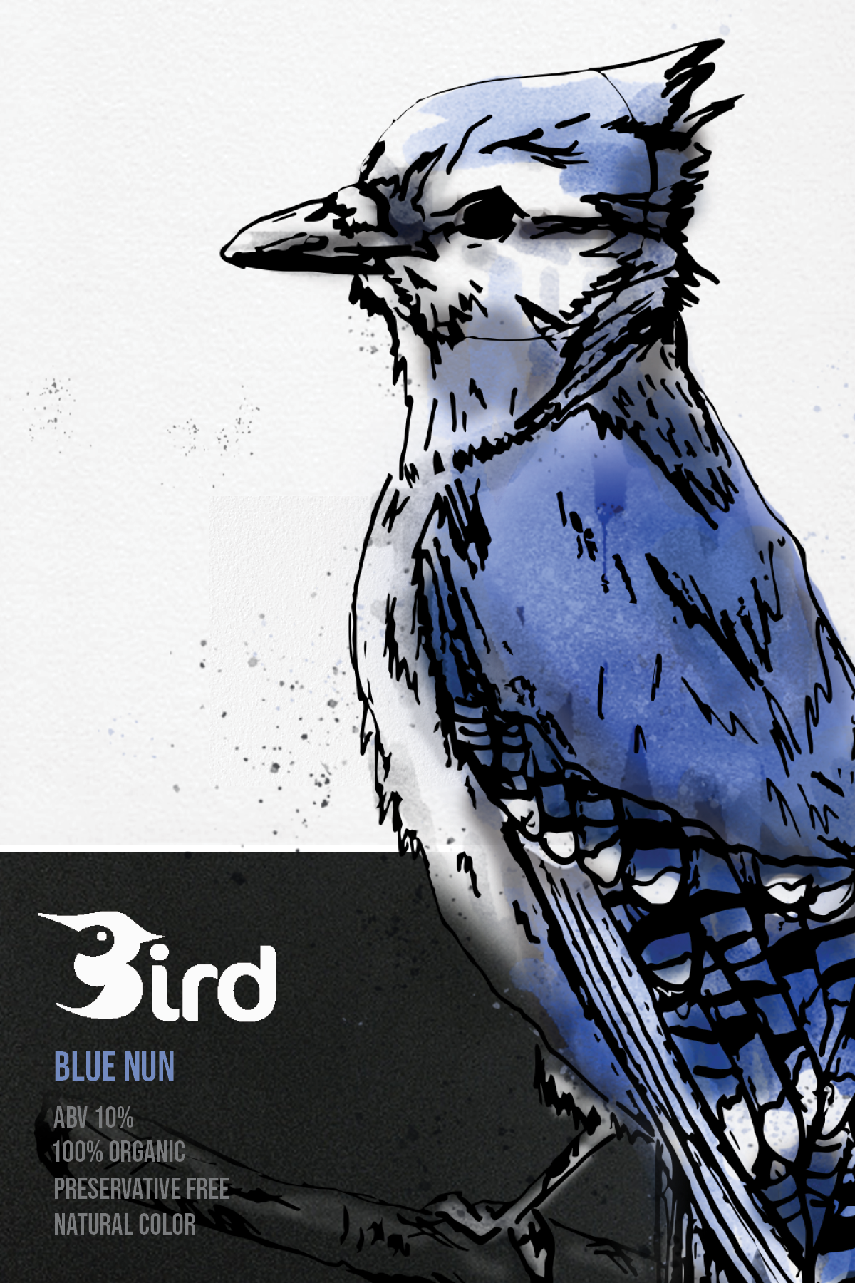
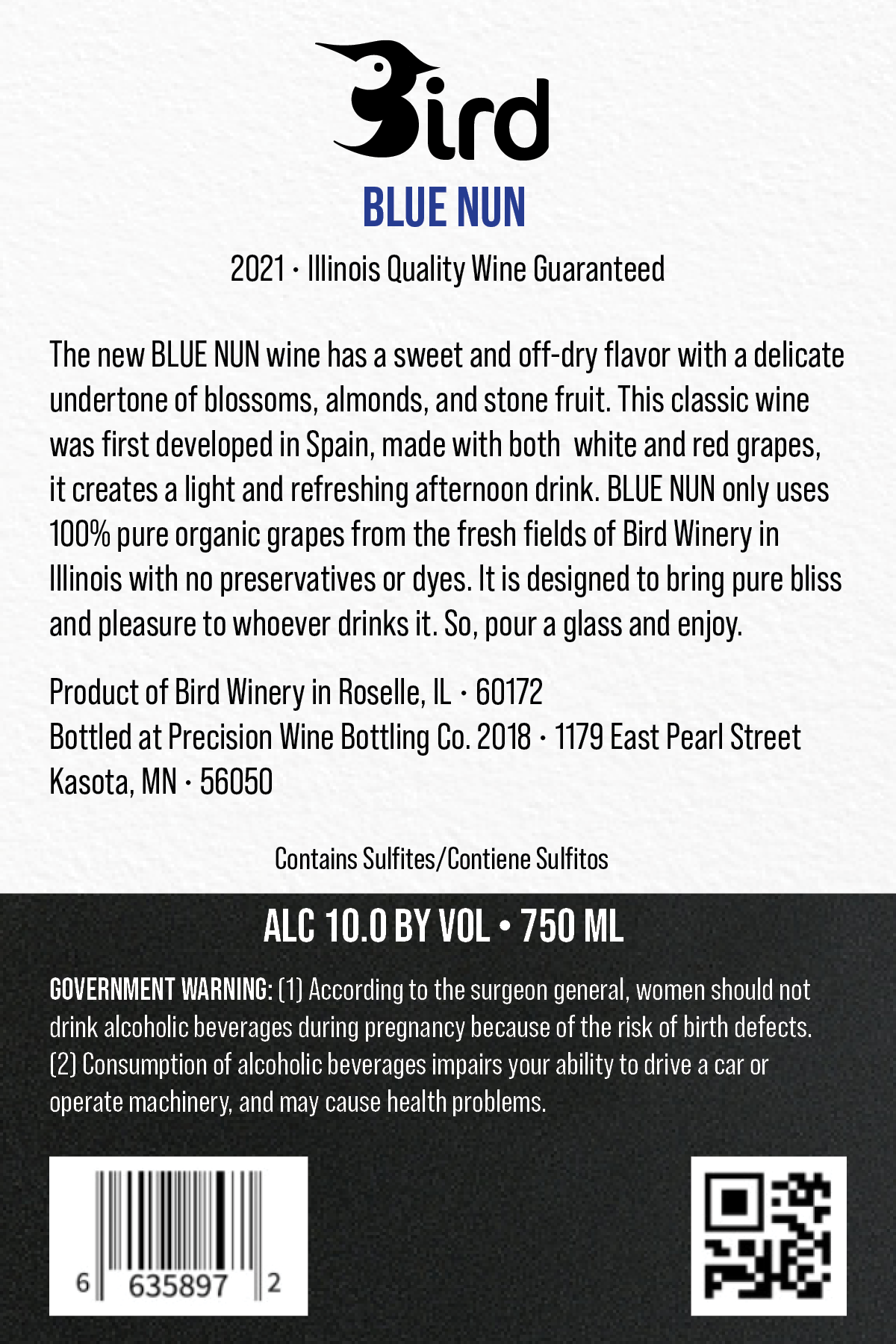
I chose to use birds from the Midwest as the focal points of the Midwestern wine labels, using a different bird for each label that matched the color and type of wine. The birds were created to look inky and sketchy to look artistic. Bebas Neue, a clean, modern typeface was used to appeal to the younger audience. I wanted the wine logo to be straightforward and reflect the design so I went with a literal and modern design and named the wine “Bird.”