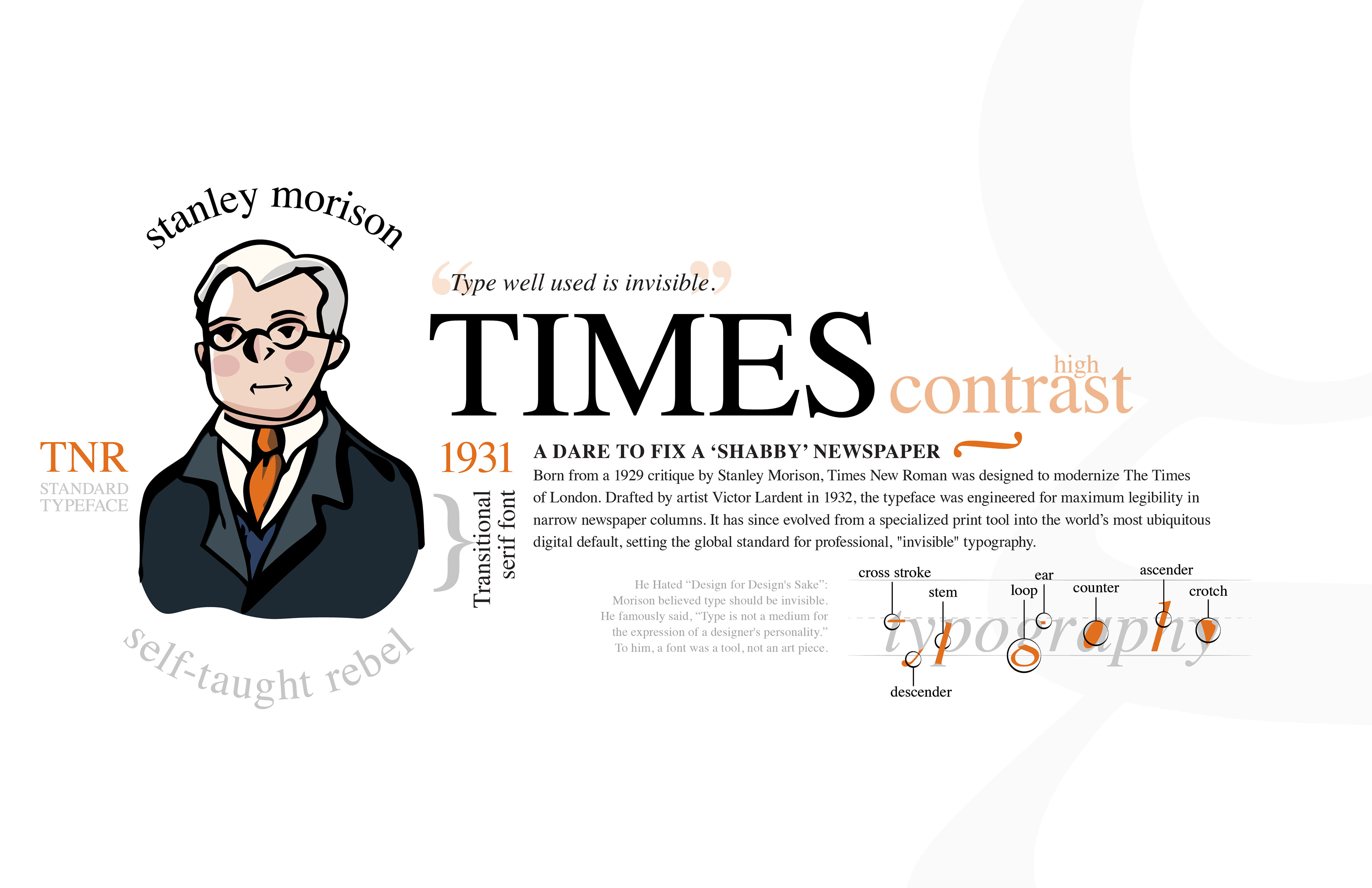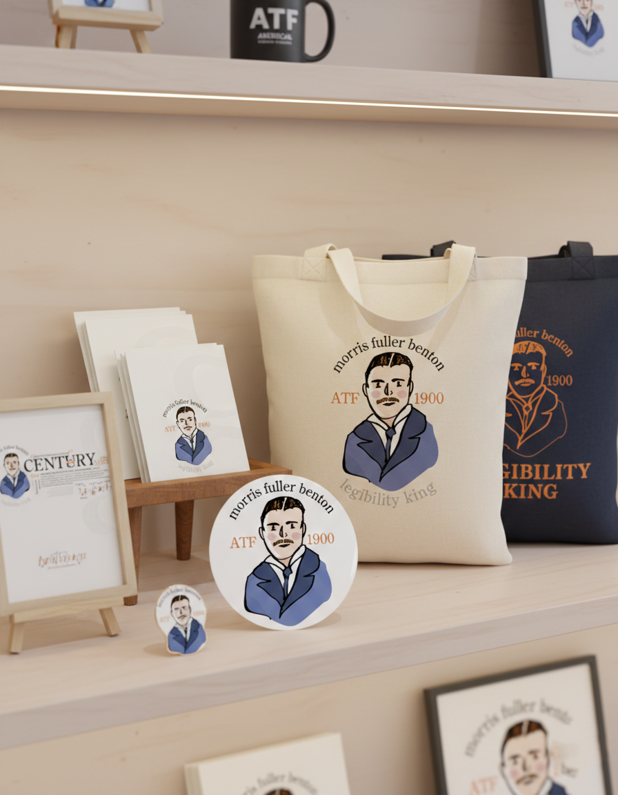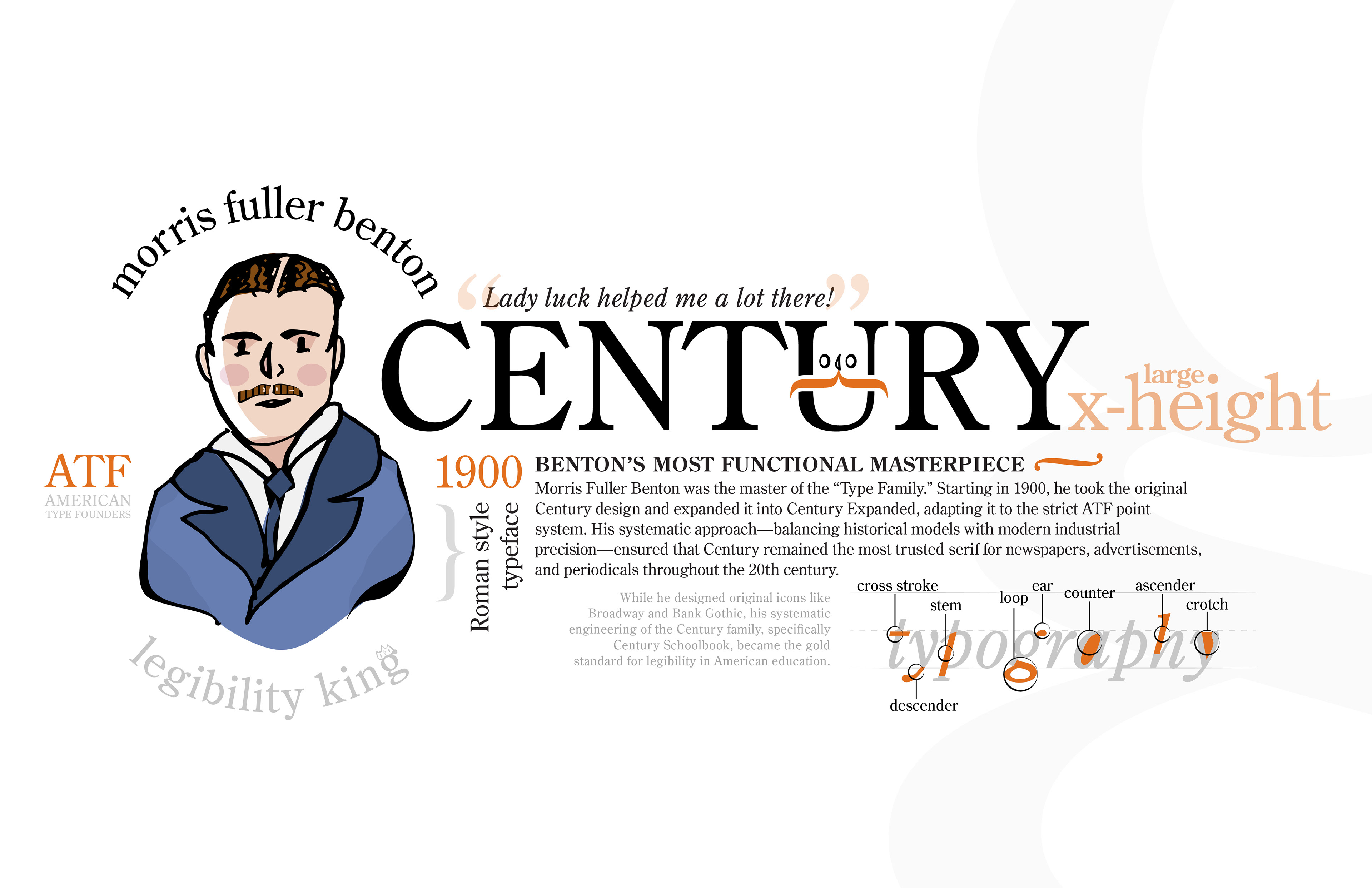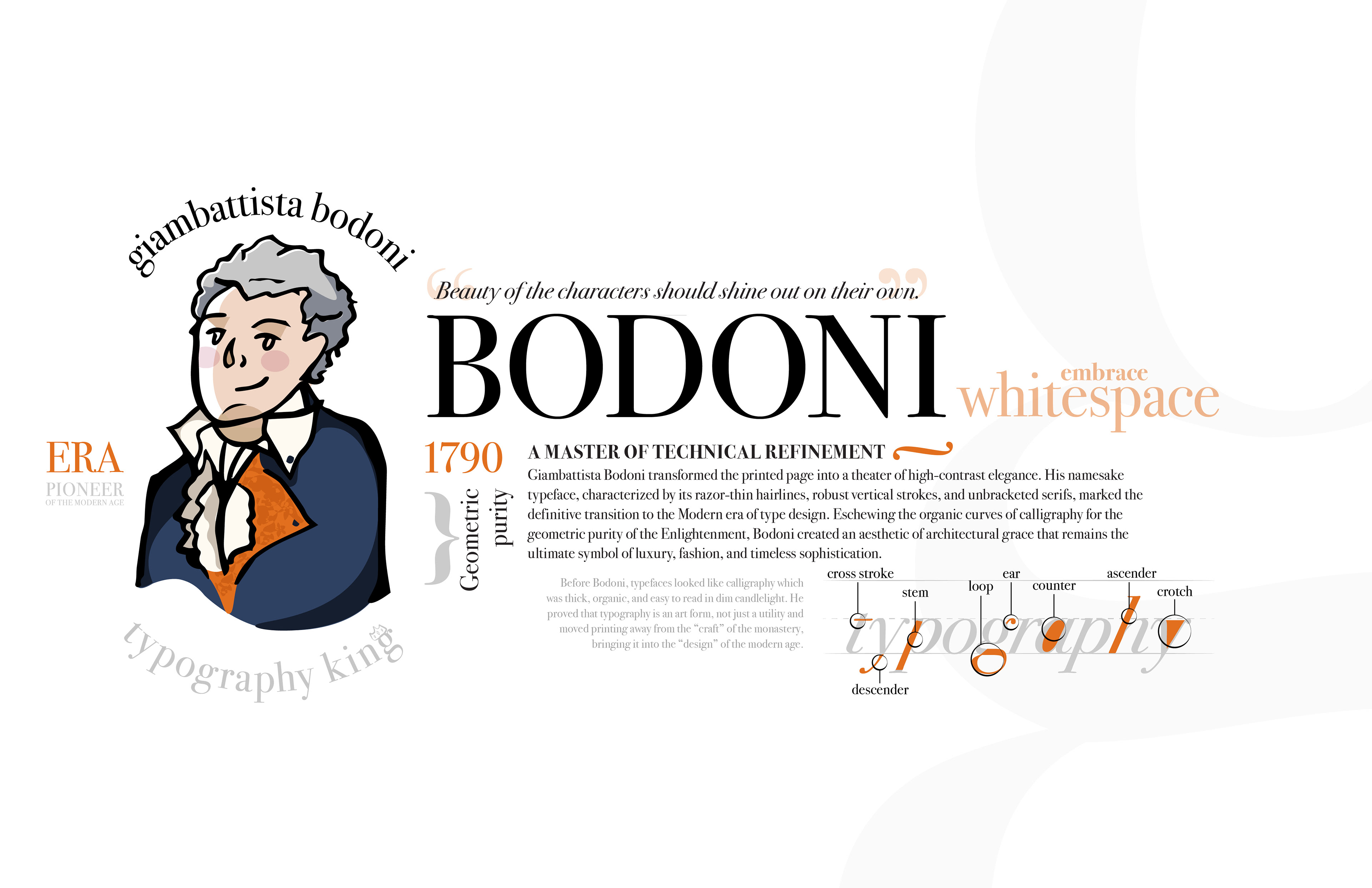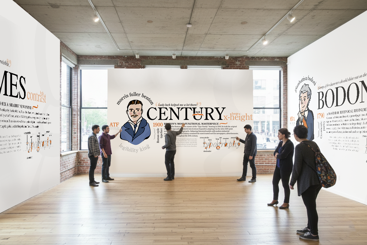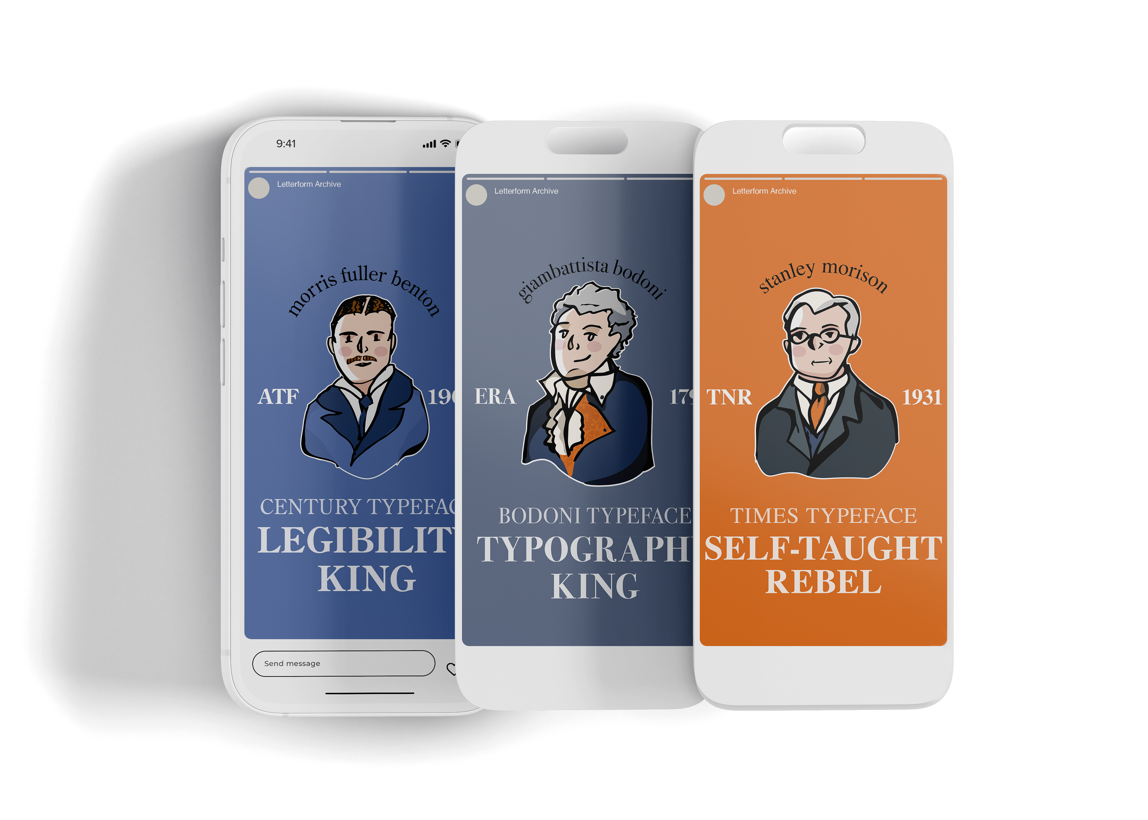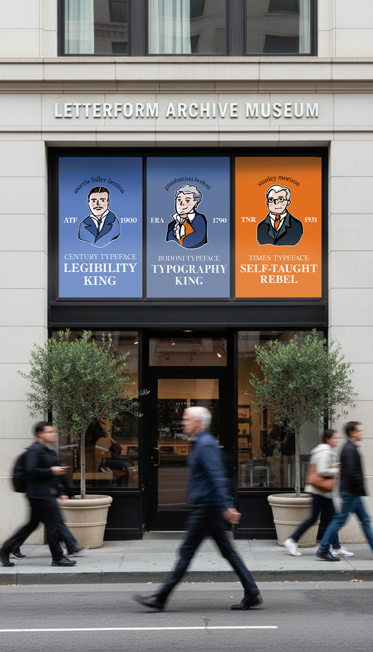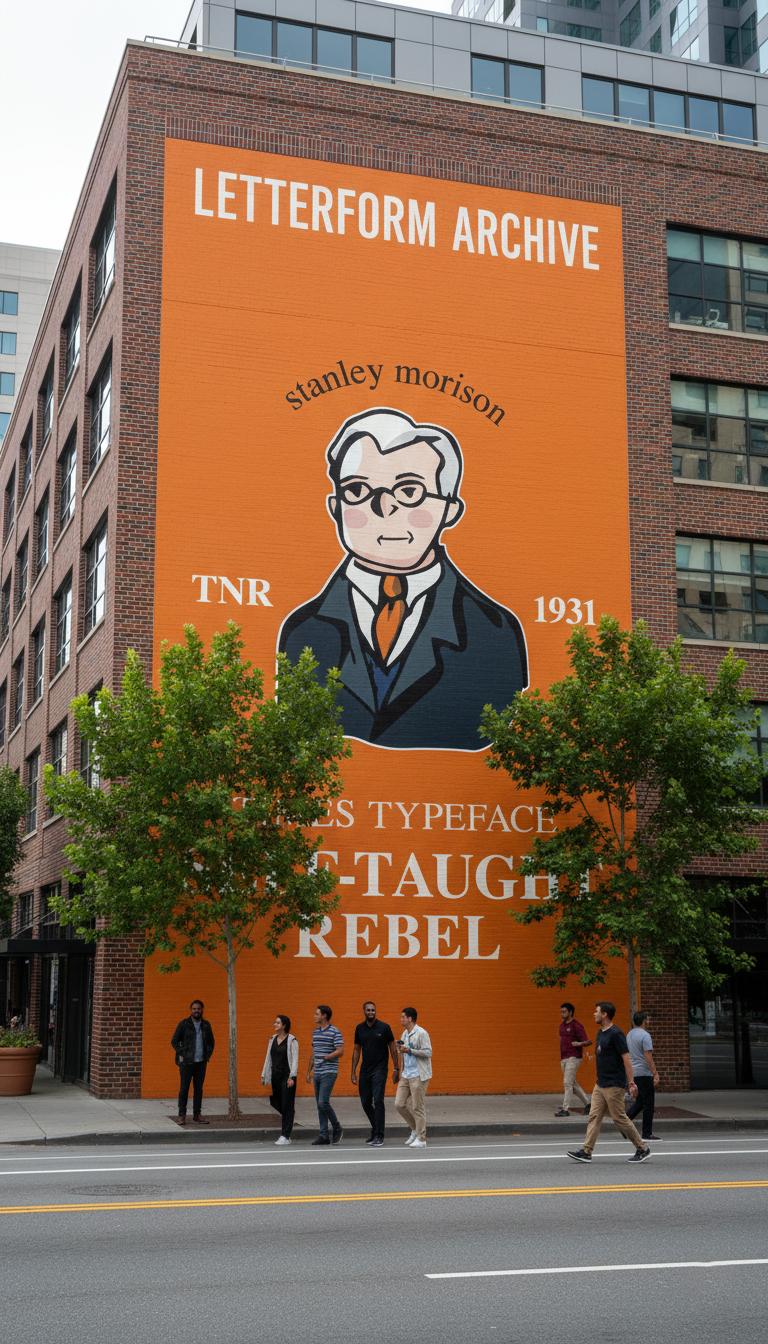
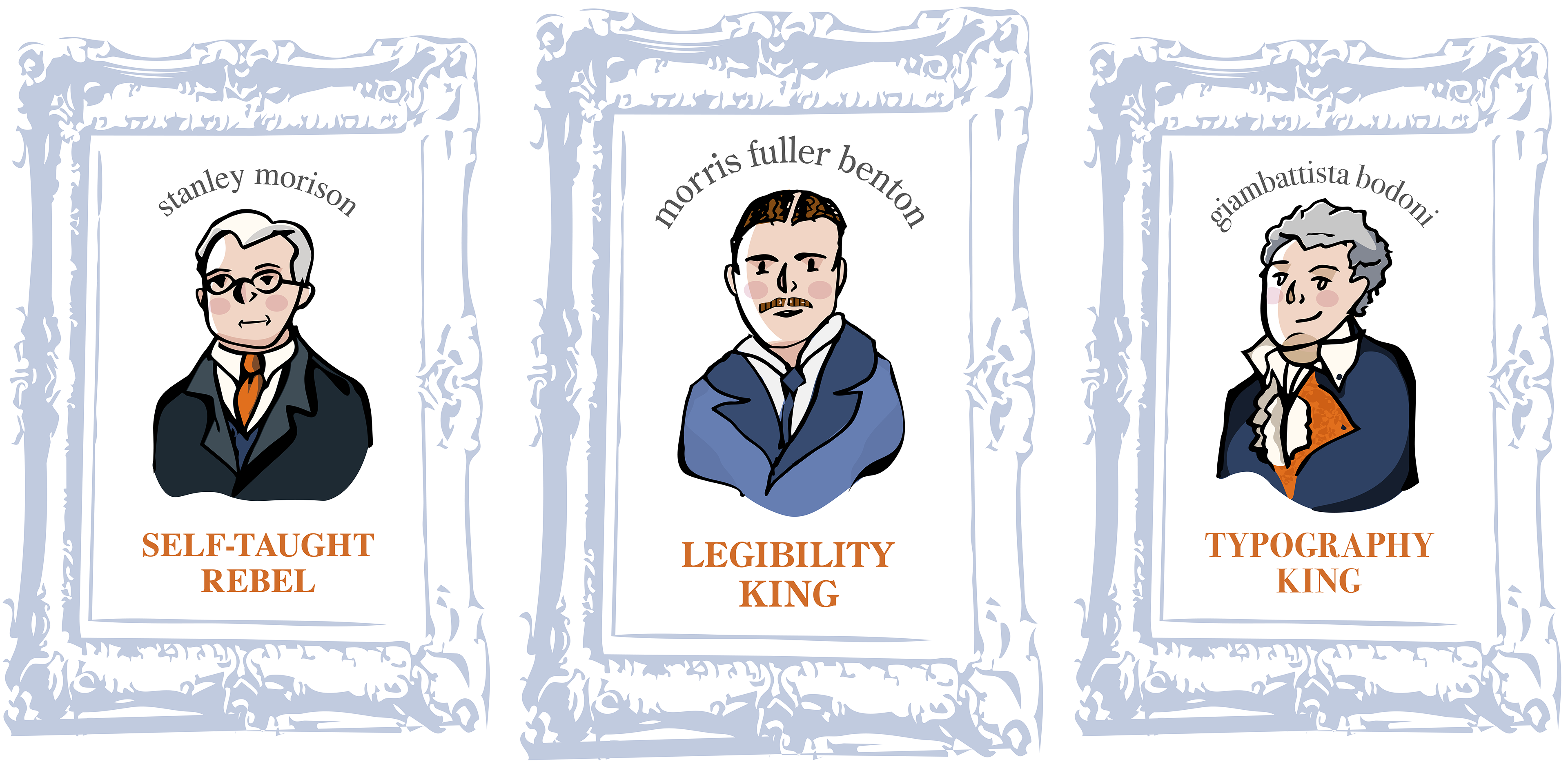
Designed for the Letterform Archive, this poster series transforms technical typographic history into a vibrant, public-facing celebration. By pairing the rigid precision of classic letterform anatomy with playful, hand-drawn illustrations of iconic designers, the project creates a striking visual contrast between formal education and artistic flair. This approach personifies the "Kings" and "Rebels" of type, turning academic diagrams into engaging lifestyle art that honors the strict rules of typography while embracing a sense of fun and accessibility.
playful drawings with rigid type is the secret sauce for designs to give it some soul.