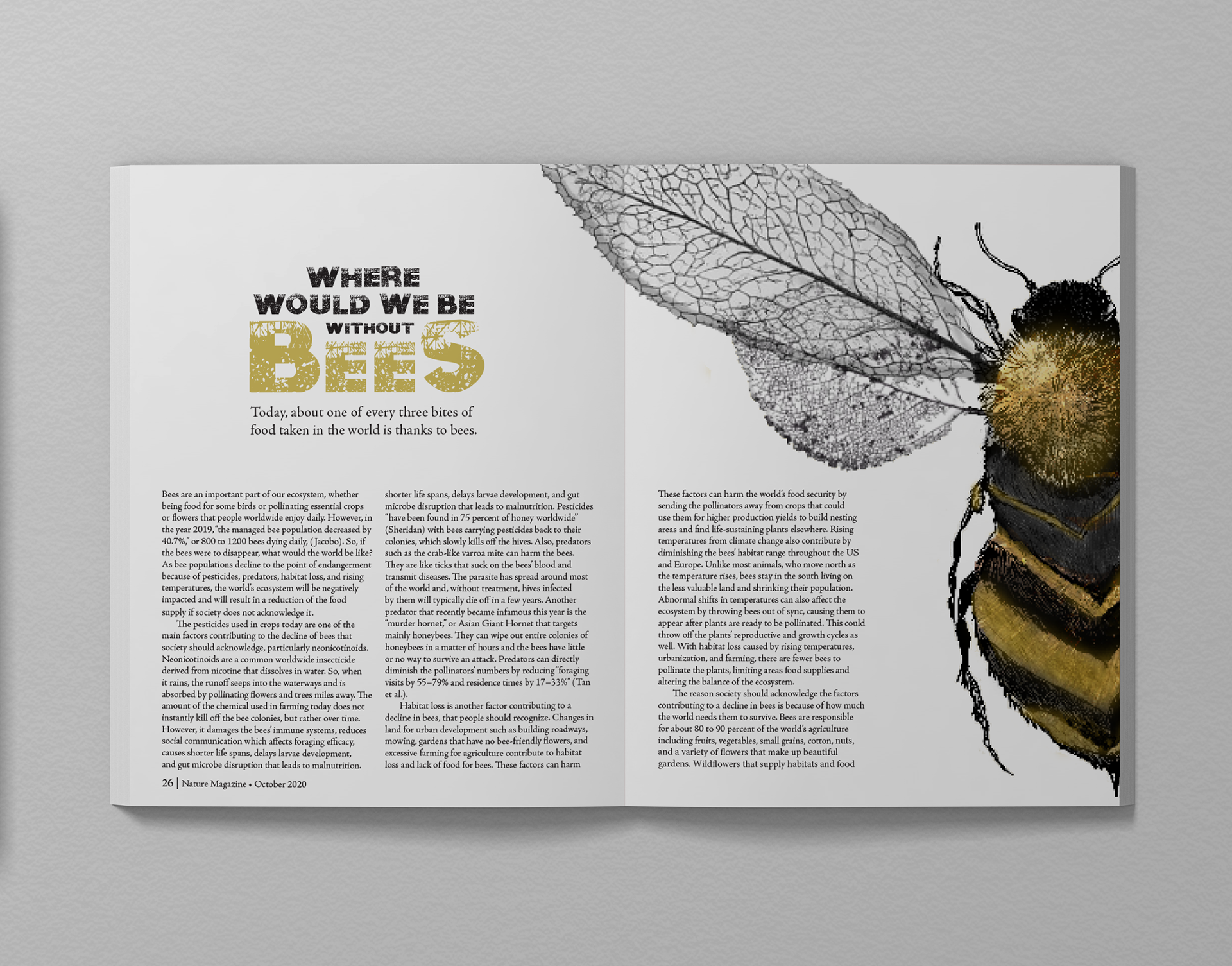
This editorial project combines original copywriting, illustration, and layout design to explore the environmental consequences of a world without bees. Designed for an educated, nature-conscious audience aged 16–30, the spread utilizes a somber, monochromatic palette punctuated by pops of soft honey-yellow to balance the gravity of the topic with the iconic essence of the subject. The visual centerpiece is a sketchy, modern illustration of a bee with wings designed to resemble decaying leaves—a chilling metaphor for the destruction of our global food systems. This theme is reinforced by the use of "Nuclear" typography, featuring decaying letterforms that mirror the illustrated style and the article’s focus on extinction. By blending evocative imagery with structured editorial design, the piece serves as a poignant call to awareness regarding the vital link between bee conservation and our future.