where eco meets elegance
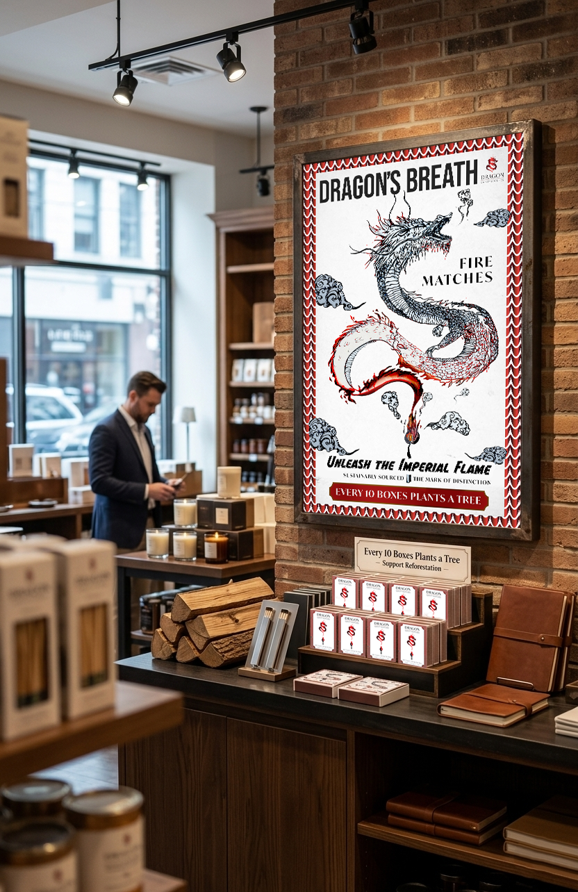
This project creates a comprehensive brand experience to reposition wooden matchsticks as a premium, eco-friendly household essential. The design utilizes a consistent vintage-inspired dragon scale border to unify the packaging and an accompanying large-format advertising poster.
The branding leverages two distinct yet connected dragon interpretations: the matchbox features a minimalist, contemporary dragon motif forming directly from a flame, while the "Dragon's Breath" poster employs a complex, hand-drawn traditional ink illustration with a fiery tail, dramatic cloud formations, and a matching hand-illustrated match.

a commitment, not just a certification.
by promising to plant a tree for every ten boxes, the brand transforms a daily household accessory into a tangible environmental impact.

