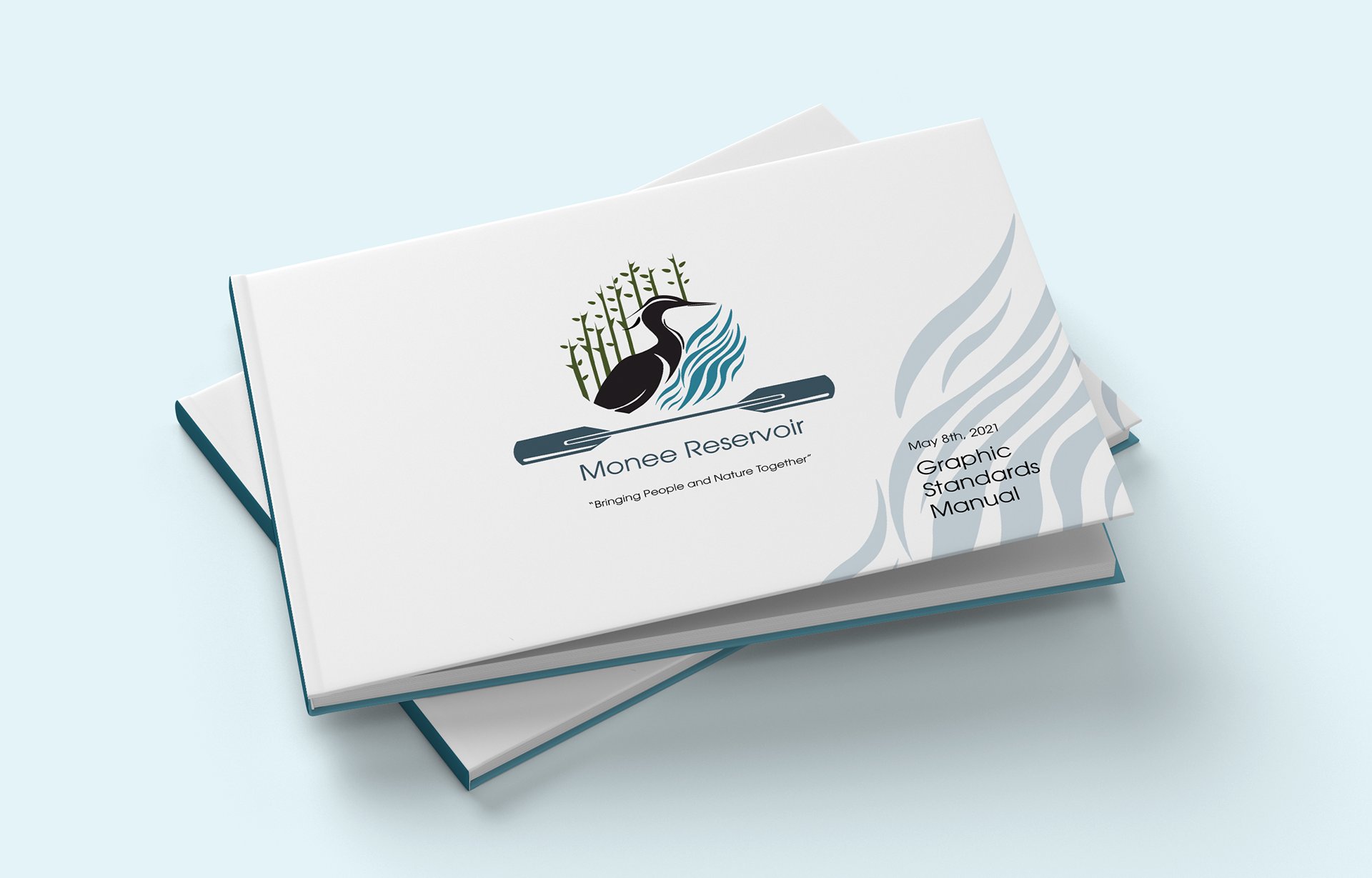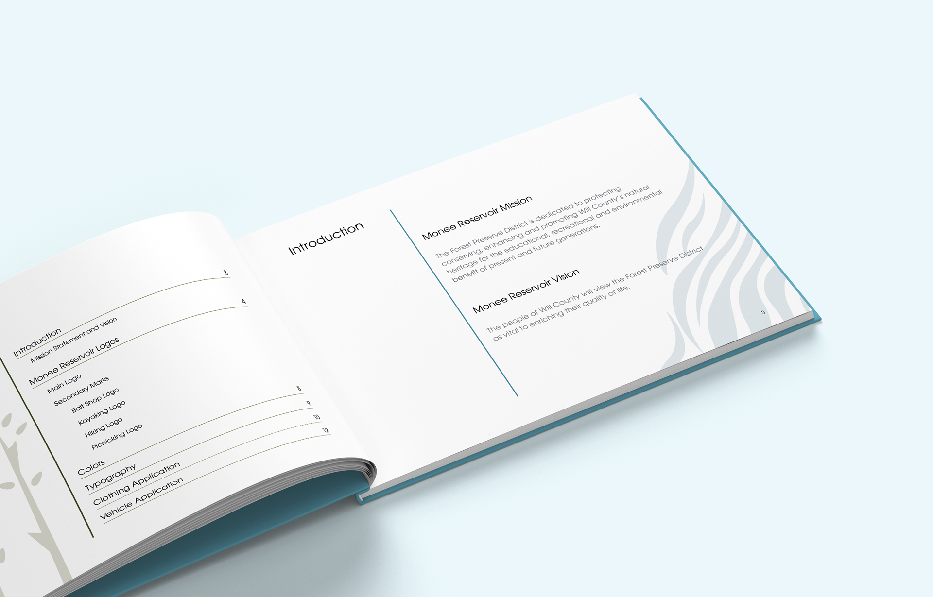
The objective was to develop a comprehensive brand identity for Monee Reservoir that resonates with a diverse community—spanning from young children and families to seasoned fishermen and kayakers. The design needed to embody the park’s motto of "bringing people and nature together" while providing a clear, professional framework for brand consistency through a formal graphic standards manual.
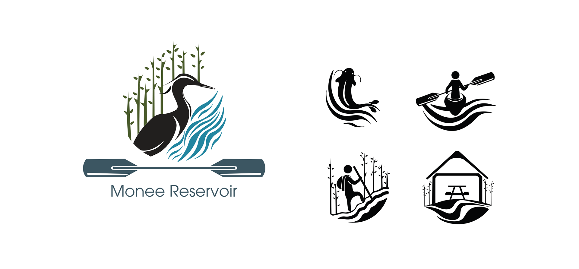
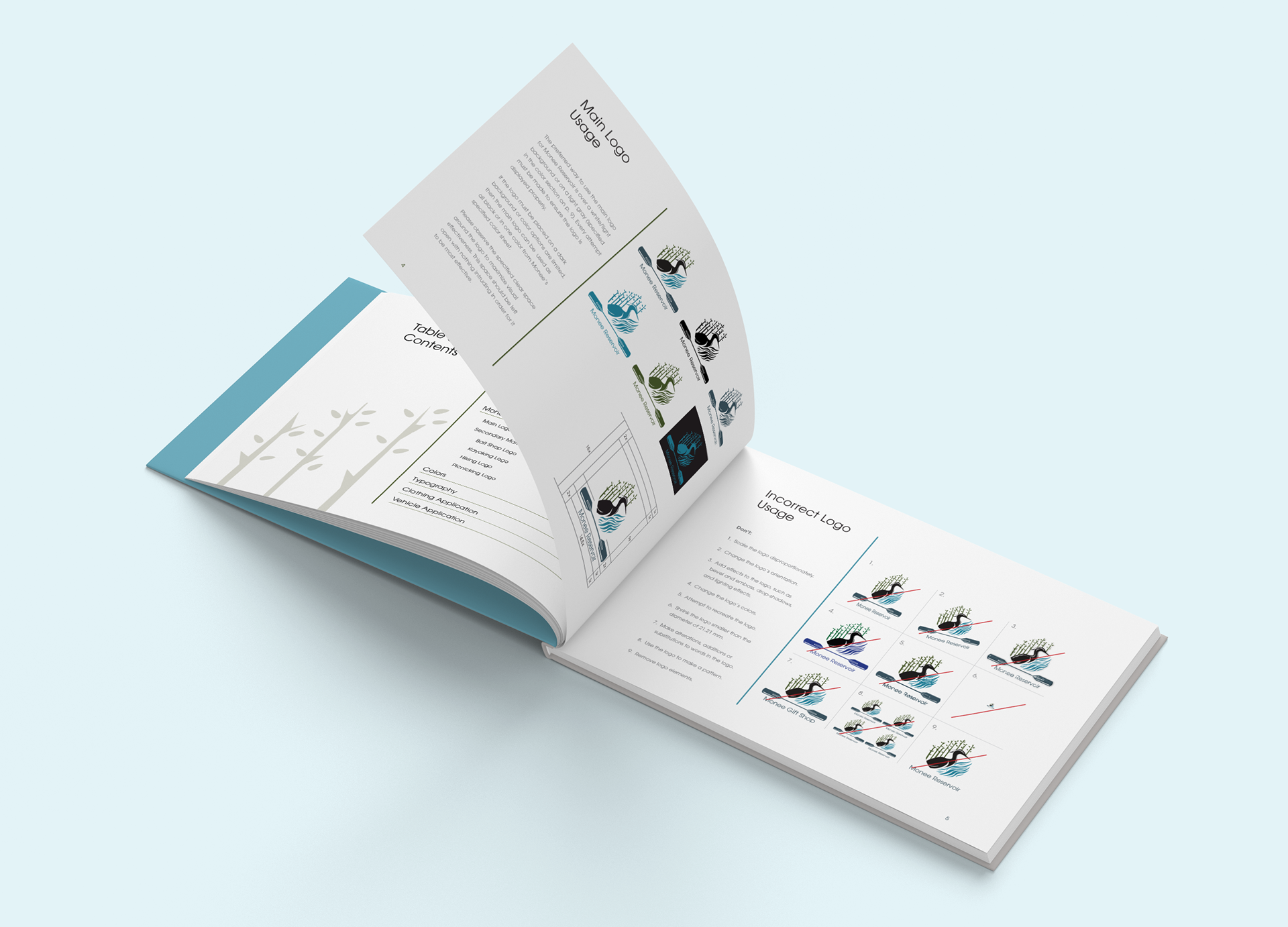
The visual solution centers on a teardrop-shaped primary mark that symbolizes the reservoir’s water, featuring the park’s native heron and forestry elements. To bridge the generational gap, I curated a muted yet upbeat color palette that feels modern and mature for adults while remaining vibrant enough to engage a younger audience. Recognizing the constraints of a government budget, I designed a series of secondary marks optimized for cost-effective, black-only reproduction. These marks utilize rounded shapes and a sophisticated play on positive and negative space to mimic the fluid movement of water. The project culminated in a Graphic Standards Manual, ensuring that the reservoir’s forest and water motifs are applied consistently across all future media and park applications.